“There will be two types of businesses in the next 5 years, those that are on the internet, and those that are out of business.” Bill Gates
The 21st century is an era of a digital revolution in human history. Hardly three decades have gone by, the internet has taken over traditional mediums as the primary source of information, communication, and entertainment. In the early days of the internet, the idea of owning a business domain was something only forward-looking businesses would entertain. Today, it’s a hard-core necessity. Whether you’re a coffee shop, a beauty salon, a retail store, or an educational institute, you need to have an online destination people can visit. Your website is no longer just an extension of your business, it’s the driving force and the future guarantee of its very survival.
Websites are essential and everyone seems to be on the same page to the extent of acknowledging it. Yet the relative importance of website design is still a matter of blithe indifference for the majority of business owners. If you do a random survey, eight out of ten websites will be so boring and superficially designed that you wouldn’t wish to take a second look at their existence. The internet has come of age but the websites businesses bear their names on are still primitive.
There’s a need to go beyond what’s crude and primitive. The physical world we live in provides all the inspiration we need in this direction. Stone Age humans needed shelters and so it was enough to find a hospitable cave. Later on, things got improved and, with human imagination at work, there were well-structured, carefully carved, and hand-painted caves. Next, came houses built with thatches, mud, and stones. Today, we have our modern homes that perfectly cater to our safety, comfort, and aesthetic needs.
What about our online homes — our websites? Per DataReportal, people spend about 7 hours on the internet each day. Do their experiences count and should the overall ecosystem of websites promote a minimum acceptable level of quality, design, and usability? Making it a bit more relatable, if you own a website yourself, have you ever been concerned with the idea of changing it, improving it, making it look nicer, friendlier, and more useful?
If your virtual destination is just another home people in the online world should see, it doesn’t harm to also learn if what you’re inviting them into is a better-looking home or a cringy cave. If the internet is to remain here and our world is to increasingly go digital, isn’t it about time we started transforming our virtual caves into virtual homes of modern standard?
So how do we go about this?
The first thing is to acknowledge you have a website that sucks. This is easy when you look at the practical role it plays to help your business grow or gain new customers. A website that has no visible contribution in this area is nothing more than a cost — if anything, you want to minimize it. On the flip side, a website that has the potential to drive traffic, boost sales, and increase brand awareness can be your most valuable strategic tool. You want to refine it, invest in it, and make it serve your business objectives more effectively.
Planning is the essence here. If you want to create a business website that works wonders, planning is what gives you the roadmap to get there. In our house analogy above, the utilitarian value of the scheme comes first — the house needs to provide shelter. Then comes the aesthetic value — it needs to be beautiful.
It’s essential not to mix things up. Design is important but a house that can’t provide protection against bad weather is of little use. So, in the planning stage, you determine the purpose your website intends to serve and how it does it. You need to begin the process by asking a few straightforward questions:
What purpose does my website serve?
Every business is unique and so is the website that represents it on the internet. If you’re an eCommerce store, you want every user to consider buying something on your platform. If you’re a dental clinic, you want the prospective clients to get in touch with you, ask about your services, and then pay your clinic a visit. If you’re in the education business, you want your website visitors to learn about your institute, why it’s better than others, what sets its programs apart, what success stories it’s proud of the most, and so on. There’s always a purpose that singularly stands out in your business context and your job in the planning stage is to determine what that is.
You’ll never be able to imagine a structure that resonates with your business goals as well as your audience’s core needs if you fail to determine the number one action that every user ideally should take on your website. Sure, you may have a number of secondary goals to go along with and your business website should be robust enough to cater to them all. But that doesn’t give you an excuse not to identify the one chief goal that moves the needle on business growth and profitability.
What is it? Do you want your website to generate more leads? Do you want to increase your online sales? Do you intend your business website to create brand awareness or do you want it to function only as a proof of authenticity? Is your primary purpose of building a website to provide after-sales support to existing customers? Do you want more subscriptions and sign-ups? Do you want to monetize your website by providing some entertainment value or catering to the information needs of people? Any of these goals are fine but each will require you to come up with a different structure and information architecture. Successful websites don’t depend on boilerplate layouts and so any structure you determine for yours needs to align with the primary purpose you’re trying to achieve.
When we look at today’s websites, there’s a general pattern or navigational structure that invariably follows. You have a homepage, an about page, a services/products page, a contact page, and then some more depending on the context of your business. Every single page serves its own unique purpose. When a user is on the homepage, you’ll want to give him a general overview of who you’re, what you do, and how your products/services can help him solve a specific problem he is likely to confront. When he gets to the contact page, your aim should be to have him pick up his phone or write you an email or fill in that contact form — you don’t want to send him off to a blog page or get lost in a row of promo videos in some other irrelevant corner. Similarly, your product or service page should provide precise information about the problem it intends to solve: what it is, who it’s for, and how it’s going to make a difference in the life of a prospective customer when given a try.
The website pages function like different sections or departments inside your brick-and-mortar operation. You’ve got a reception, a sales department, a production department, a finance and accounting department, HR and R&D departments, and so forth. A visitor who drops in may not care to take a peek in all directions or inspect every place within the office. In most cases, his concerns are likely to be addressed in the reception area. On the website, a visitor may take the liberty to poke around a little bit; but eventually he’ll want to save time, take an action, and bounce away with his problem addressed. So, where is he likely to land first? On the homepage for sure.
The homepage is where a user’s journey begins and it’s where you need to implement the strategy in the most refined way possible. What’s more, not all places are equal within a homepage. If you section it out in terms of information hierarchy, the above-the-fold area is where you need to place your most important message.
The above the fold section is what a user sees when the page loads without him having to scroll down. Just like newspapers present the most attention-grabbing headlines, content, or imagery above the fold — the top half of the page — your website benefits when you place the most important message in the most accessible area.
Donal Miller, the author of Building a Story Brand, puts it this way: “I like to think of the messages above the fold as a first date, and then as you scroll down you can put the messages you want to share on a second and third date. But as we’ve talked about, the stuff you share on a first date should be short, enticing, and exclusively customer-centric.”
So much for the homepage. Now, instead of talking about it, let’s take a quick look at a few example homepages of companies we all know and admire. If the strategy is working for them, it should be working for us.
Starbucks
Starbucks is fairly clear about their number one goal on the website: they want you to sign in to your Starbucks Rewards account and play each day. That’s their primary goal as far as the website is concerned. Sure, they would also like for you to order their new Iced Toasted Vanilla Oatmilk Shaken Espresso or their Pink and Dragon Drinks, but these goals appear to be secondary. Joining Starbucks Rewards means more than a one-time deal. It’s continuous engagement and a way to boost the lifetime acquisition value of a customer. They know how to effectively use their website to generate sales and act only in the best (and long-term) interest of their business.
Apple
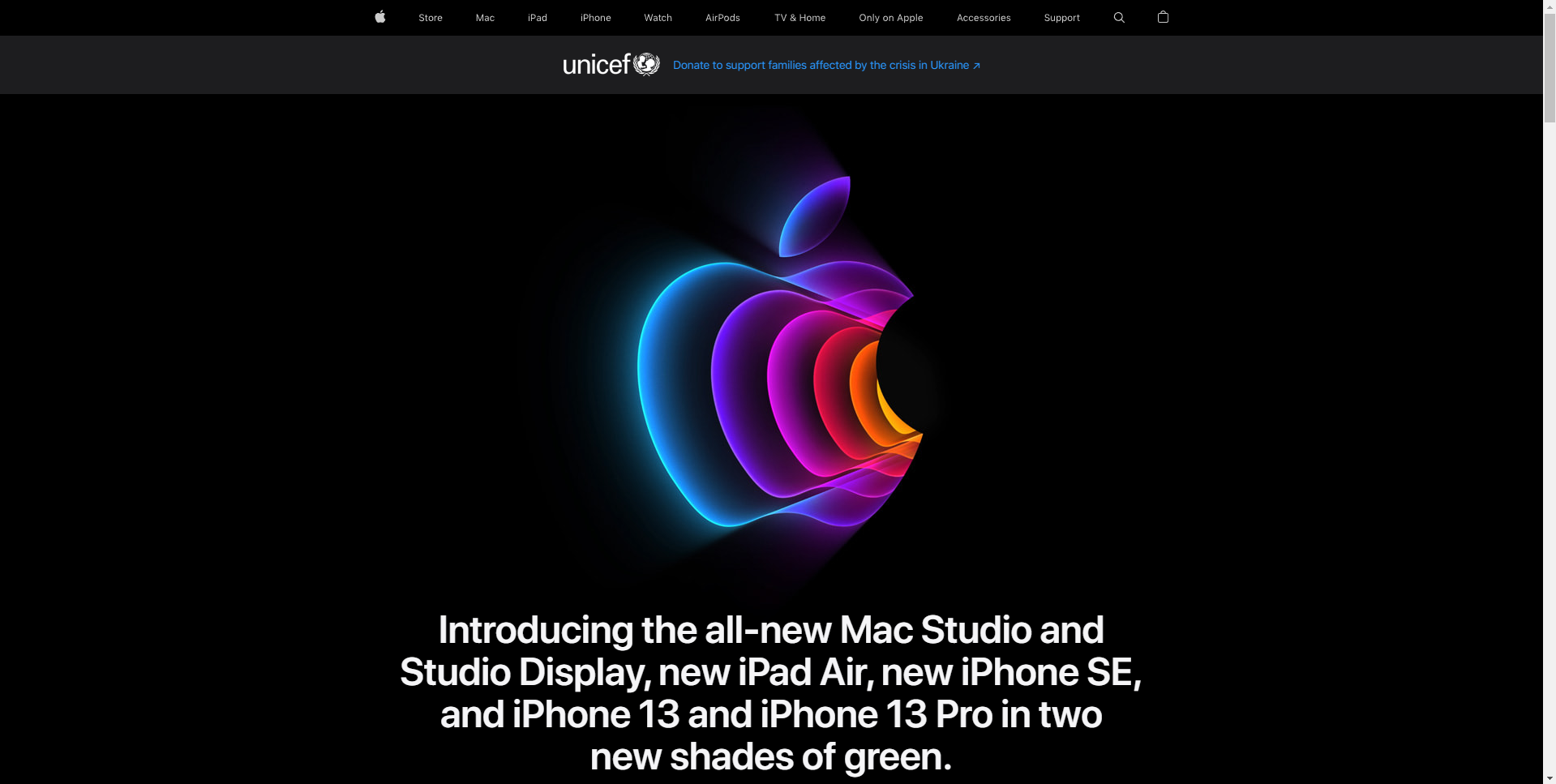
If you’re Apple, you can afford to introduce so many fancy things on the homepage and change them all the more frequently. At the current, Apple seems to zero in on their newly launched Mac Studio, Studio Display, iPad Air, iPhone 13, and iPhone 13 pro. So boosting the sales of these products seems to be the primary goal they intend to achieve on their site. How do we know that? By looking at how content is arranged on the homepage. The featured area or above the fold section of the homepage gets the most eyeballs and, therefore, is reserved to promote the most important (though, in this case, short-term) goal of the company — i.e., selling more products.
Shopify

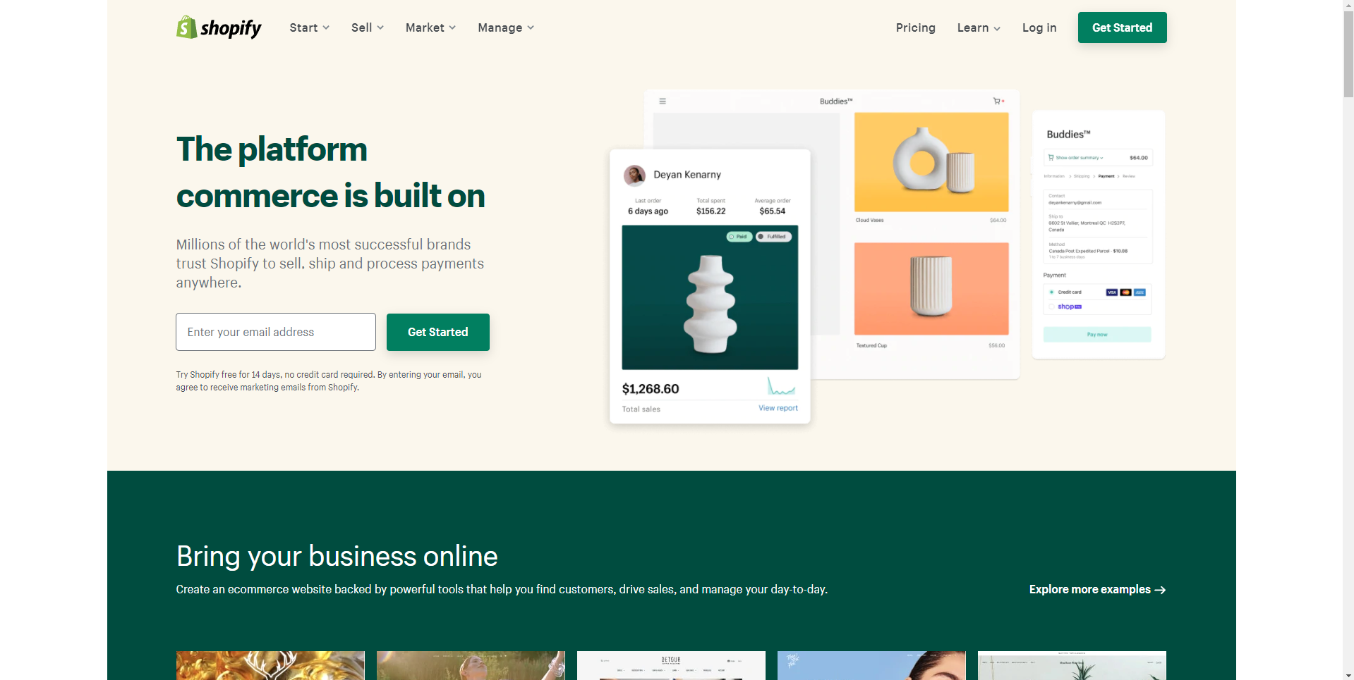
Shopify is laser-focused on getting you on board. “The platform commerce is built on” is a bold claim in itself and they reinforce it with the statement “Millions of the world’s most successful brands trust Shopify to sell, ship, and process payments anywhere.” What else is there to say to build an instantaneous rapport and get you to click that “get started” button? The message is clear, concise, and purpose-driven. Also notice the primary call to action (CTA): Get Started. It’s prominent, inviting, and strategically placed. You can’t miss it because it’s everywhere — on the header, in the featured section, above the footer, and across the entire website.
Nike
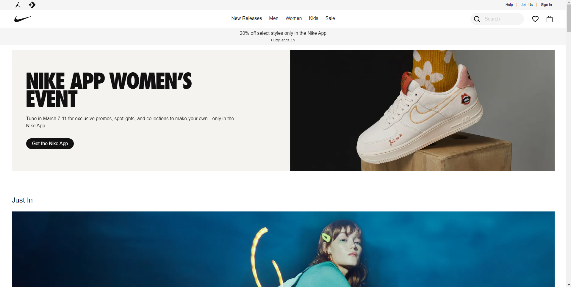
Just like Apple, Nike’s strategy for the homepage is pretty dynamic. They don’t have a static homepage that stays the same throughout the year. The above the fold section works like a sales magnet and is used for the most trendy collections, featured styles, new promotions, and just ins. It’s also used for lead generation and their proprietary app promotion. Like the current prompt: “You’ve got until March 11 to join in on exclusive drops, spotlights, and collections to make your own—only in the Nike App.” Everything is action-driven, focused, and enticing. Nike knows how to tape into their consumers’ psyche and boost sales through the power of a well-equipped website. The homepage is where they create a curb appeal and entice people into exploring different possibilities — sign in, sign up, get started, shop, get the Nike App, become an exclusive member, and so on. In short, they are not soft-selling and neither should you.
Coursera
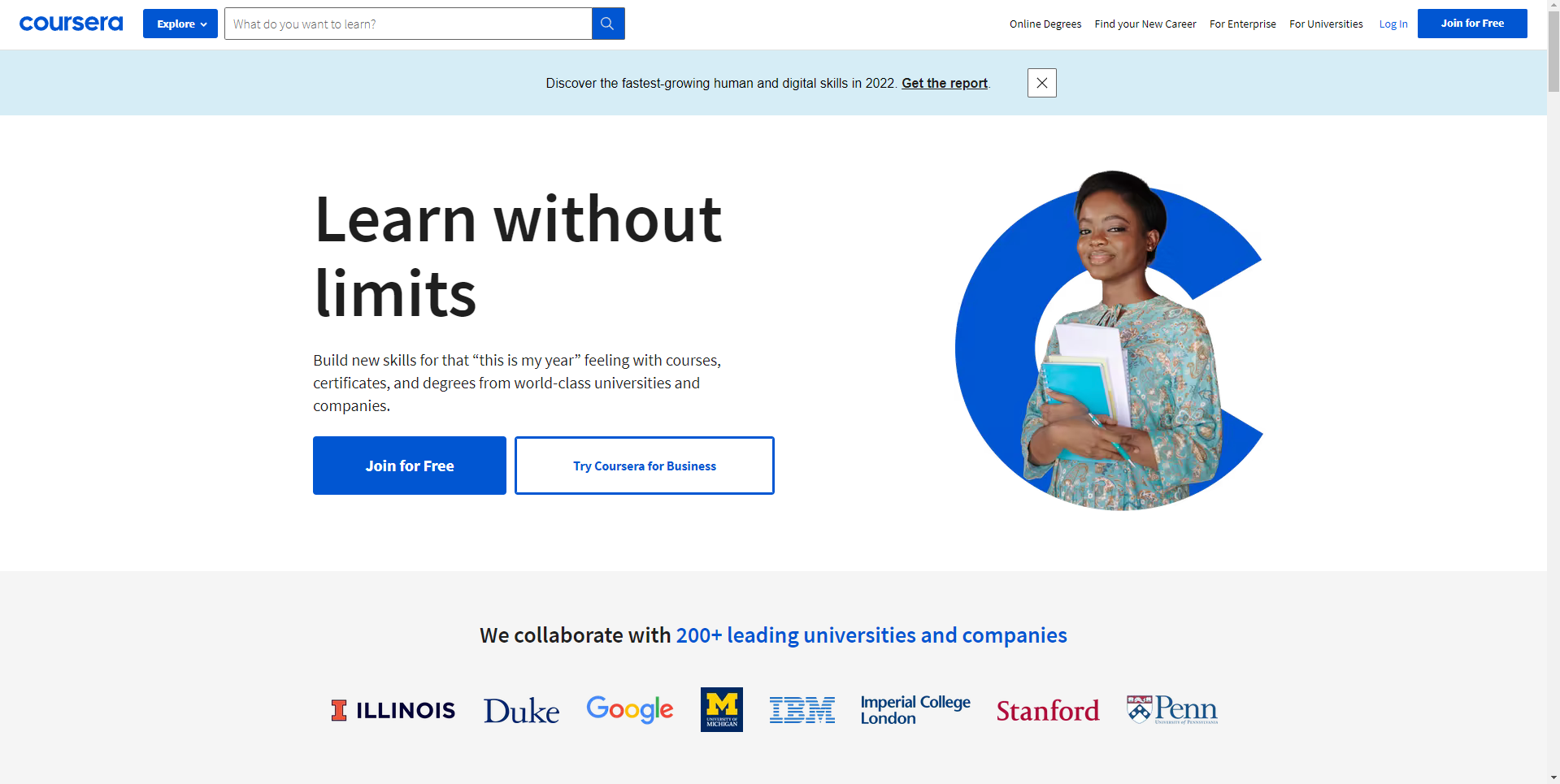
Coursera wants you to do one of three things on their platform: buy courses, earn professional certificates, and earn degrees from world-class universities. These three product categories make up 99% of what they do and in less than twenty-five words they perfectly communicate it to their website users. As clear as their end goals are, Coursera still doesn’t push you to reach into your pocket and process an order in a flash. They seem to be okay with you taking your time and considering buying something only when you’re ready. That’s why the “join for free” CTA (call to action) as the primary focus in the homepage’s featured section.
Blend design thinking with business goals.
Sure, people want functional and purpose-built websites. But more than that, they want websites that are functionally on par and aesthetically appealing. Design is a very important component of everything that goes into building a website. Good designs attract and bad ones repel. The human mind has a special knack for appreciating what’s beautiful and avoiding what’s ugly. That’s why when you look at the historic evolution of most products that became commercial hits, design appears to be at the heart of the overall brand experience.
What’s rather interesting is that design is a subjective quality that continuously evolves and adapts to the changing times and consumer preferences. It’s easy to think that the best-looking model from a certain brand today, no matter how functionally intact it presently is, will lose its design relevance some years from now. If you’re a car lover, imagine taking all the amazing features of a 2022 Cadillac sedan and putting them in a 2-door club coupe Cadillac of 1935; how likely is it that people will still consider buying such a car in 2022? Very unlikely. Again, take a look at an Apple PC from the eighties and compare it with a modern iMac; what’s about the iMac that makes people want it so bad? Its design for the most part.
Websites have undergone their own evolutionary phases, both from the perspective of design and development. What’s unfortunate is that most businesses don’t seem to appreciate the progress even today and are content with websites that are no better than their counterparts from decades ago.
What it would be like if a successful brand like Nike followed the same practice? Something like this may be:
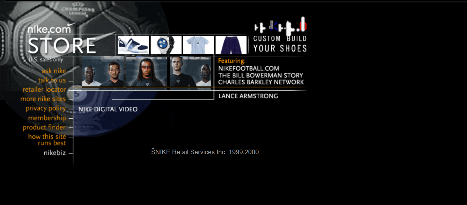
Yes, that’s how Nike’s website looked in the early 2000s — more than two decades from now — but today it’s not only different, it’s by an order of magnitude better!

Quite an improvement! But the good thing is that it’s easily achievable and every business can achieve the same goal with a bit of effort and investment.
When we talk about design, it’s not only the outer part or what’s visible to the naked eye that carries weight; of equal importance is how it’s designed to function from the inside. Design thinking entails an unmistakable alignment between a product’s functional value and aesthetic experience. In other words, a design approach that focuses more on giving better visual appeal but less on delivering better functional value ultimately fails to win customers. Striking a unique balance is very important.
For example, what goes inside an iMac — its software, tools, and operating system — is just as important an aspect of the design thinking as is the outer shape. The more seamlessly designed these inner components are and the better they function, the better will be the overall product experience.
Websites are no different when it comes to design. In fact, the design thinking approach briefly discussed above can be applied to websites pretty much the same way it’s applied to any physical product. Flashy websites with lots of impressive design elements will still fail to retain visitors if they serve no clear purpose or hinder users from performing the necessary actions.
The few example screenshots of websites shared earlier give us a fair idea of what a decent website should look like. Their designs are sophisticated enough, yet they perfectly complement the functional purpose they are primarily designed to serve.
Understand SEO principles
Designing a website that perfectly caters to users’ expectations only gets you so far. How are you going to ensure that people find your website in the first place? Unless you’re a market leader in a specific product/service category, not very many people will know you by your brand name or search your business online. This is where incorporating SEO principles in the design process comes in handy. Both the front-end copy and the back-end meta elements of your business website need to be well-optimized for search engines. Why? Because having a well-optimized website helps search engines like Google boost your organic rankings and increases its chances of getting found by relevant people. While the implementation of SEO techniques requires an adequate understanding of the process as well as a hands-on collaboration from different people on the team — usually copywriters, developers, and SEO experts — it’s well worth the effort considering the long-term ROI it’s able to generate. The process of SEO and what essential role it plays in the success of any website is interesting. If you’re curious to find, I’ve written a detailed guide on this subject which you may access here: The Definitive Guide to SEO: From Fundamentals to Advanced
In the final analysis, there are two mindsets with which most of today’s business websites are designed and developed: one considers a business website to be no more than an online reference to an offline business; the other considers it as a strategic engine for corporate growth and profitability. Which mindset represents your approach is what’s going to determine the future success or failure of your website.
 +1-713-701-5823
 +92-518-441-742