 +1-713-701-5823
 +92-518-441-742
In today’s dynamic digital sphere, mobile devices have seamlessly integrated into our daily lives, shaping how we access information and interact online. With this paradigm shift, search engines have recalibrated their algorithms, placing a premium on mobile-friendly websites within their search results.
Google, in particular, embarked on this trajectory as early as 2015 with its mobile-friendly update. Subsequently, in 2016, mobile-first crawling and indexing were introduced, marking a pivotal transition in how websites are evaluated and ranked. This shift empowered Google to prioritize indexing content visible on mobile devices, aligning with the evolving browsing habits of users.
Mobile-first indexing stands as a cornerstone for enhancing visibility on search engines and engaging target audiences effectively. Before delving into actionable steps to prepare your site for mobile-first indexing, let’s understand the concept with a bit more clarity.
What Exactly is Mobile-first Indexing?
Mobile-first indexing refers to Google’s preference for indexing the mobile version of website content over its desktop counterpart.
Historically, Google relied heavily on a site’s desktop content to ascertain its relevance to user search queries—a methodology suited to an era dominated by desktop browsing. However, more than half of internet users now use mobile devices for online searches, making Google prioritize a better mobile experience.
Understanding the Significance of Mobile-first Indexing
Even if your website functions impeccably and appears visually appealing on desktops, the absence of a mobile version can significantly impact its ranking. A lower-quality site with mobile compatibility will likely be indexed before yours.
While Google may still index your site despite its lack of mobile-friendliness, it will prioritize crawling and indexing the mobile version beforehand.
In essence, to ensure your site garners priority indexing and attains prominent rankings on search result pages, it’s imperative to optimize it comprehensively for mobile devices.
How to Optimize Your Site and Embrace Mobile-first Indexing?
You can employ numerous strategies to enhance your site’s mobile-friendliness and improve its visibility and search engine rankings. If you are in the process of optimizing your website for mobile devices, consider implementing the following strategies:
Craft a Mobile Responsive Website Design
Developing a responsive mobile website design is a fundamental step in implementing mobile-first indexing. This approach requires creating a design that seamlessly adapts to various portable devices, including tablets and smartphones. All site elements—such as text, images, columns, navigation menus, CTA buttons, and interactive elements—should be easily accessible and legible across different screen sizes.
When crafting your mobile version, adopt a design-thinking approach to ensure all elements remain visible on the screen without the need for horizontal scrolling or zooming. Pay close attention to factors like font size, spacing, paragraph length, and button size to enhance readability and usability. Additionally, incorporate touch-friendly elements and optimize images to enhance page loading speed and deliver an optimal user experience.

In short, prioritizing a responsive design not only enhances user experience and reduces bounce rates but also enhances search performance by aligning with mobile-first indexing principles.
Focus on Optimizing Mobile Speed
Did you know that about 40% of users abandon a website if it takes more than 3 seconds to load? This statistic underscores the critical importance of a fast-loading website.
Our main objective here is to enhance the speed and performance of your mobile website to ensure a superior user experience and higher engagement. Utilizing tools like Google PageSpeed Insights provides invaluable insights into your site’s loading speed, assigning a performance score out of 100. Armed with this information, you can take the necessary steps for mobile speed optimization, including:
- Image and video optimization
- Minimizing redirects
- Condensing unnecessary code
- Streamlining scripts
- Reducing server response time
- Leveraging browser caching
Prioritizing mobile speed optimization not only satisfies visitors but also boosts click-through rates and signals to Google to elevate your site’s ranking on SERPs.
Optimize Website Content for Mobile
Tailoring content specifically for mobile users is another crucial facet of mobile-first indexing. Given that mobile browsing, behaviors differ from those on desktops, it’s essential to customize your content to cater to their preferences.
Here are some helpful tips for crafting content optimized for mobile devices:
Use clear and descriptive headings: Headings play a vital role in guiding users and providing a quick overview of your website’s content, aiding in easy navigation.
Craft concise and engaging content: Mobile users tend to skim through content, focusing only on relevant information. To cater to this behavior, write succinct and interactive content, utilizing shorter paragraphs and bullet points and highlighting key points for enhanced readability.
Design clear CTAs: Optimize your website’s calls-to-action (CTAs) to prompt specific actions from users. Ensure your language is persuasive and easily comprehensible, and design your CTA buttons to be easily clickable for mobile users.
Integrate Schema Markup
Structured data, also known as schema markup, is a potent tool that provides search engine crawlers with deeper insights into website content. By incorporating schema markup on your site, you can significantly enhance search engine rankings and click-through rates. When users visit your website, it sends a positive signal to Google crawlers, indicating its suitability for mobile-first indexing.
While adding schema markup may seem daunting to some website owners due to its technical nature, the process is relatively straightforward. Utilizing tools like the Schema Markup Generator, you can generate HTML code tailored to your content type and seamlessly integrate it into your site.
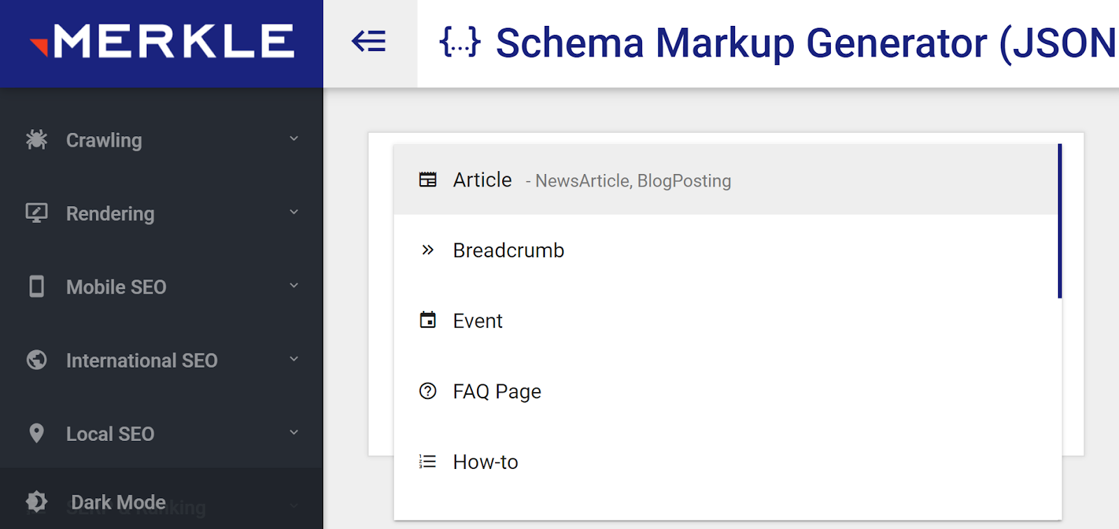
This practice of implementing schema markup can elevate search listings and bolster visibility in mobile search results.
In Conclusion
Mobile-first indexing has emerged as a crucial aspect of navigating the expansive landscape of the Internet. It’s a fact that webmasters cannot afford to overlook if their aim is to secure high rankings in search result pages. With the majority of internet users accessing content via mobile devices, optimizing your website for mobile is imperative.
Successful implementation of mobile-first indexing entails modifying websites to cater to mobile users, encompassing optimization of website design, content, page speed, and performance.
These optimization endeavors not only enhance user experience and engagement but also extend the reach of your audience on the website. Therefore, prioritizing mobile-first indexing is paramount for steering your website toward heightened search engine rankings and fostering business growth.