 +1-713-701-5823
 +92-518-441-742
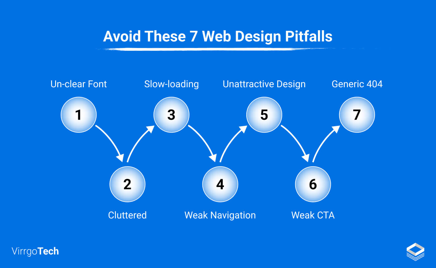
‘’Design is the silent ambassador of your brand” — Paul Rand.
Your website design significantly influences your brand image. If you want to deliver the true essence of your brand to your audience, your website should be well-built and functional for every visitor.
Do you know that on average a visitor takes 0.05 seconds to form an opinion about a website?
What does that mean? It means you’ve got only one shot to impress your potential visitor. If your website is not appealing to the visitor in all respects, it won’t take long before he decides to bounce away!
To avoid this scenario, we’ve compiled some common website design mistakes that every website owner should consider important and fix immediately.
Here they are!
1- Unattractive Web Design, Color Scheme, Font
A poor website design might be hampering your website’s potential. Multiple factors lead to a poor web layout and unappealing design such as font style, typography, color scheme, etc.
A study by ResearchGate claims that 94% of users’ first impression of a website is design-relevant. That’s a staggering figure and it should make us instantly realize why first impressions matter. If the visitor is not happy with what your website looks like, it will count as a negative user experience. Undoubtedly, UX (User Experience) is one of the most significant factors for lasting connections with your target audience. So, ignoring its importance isn’t a wise approach.
But how can you evaluate whether your website design is bad or not?
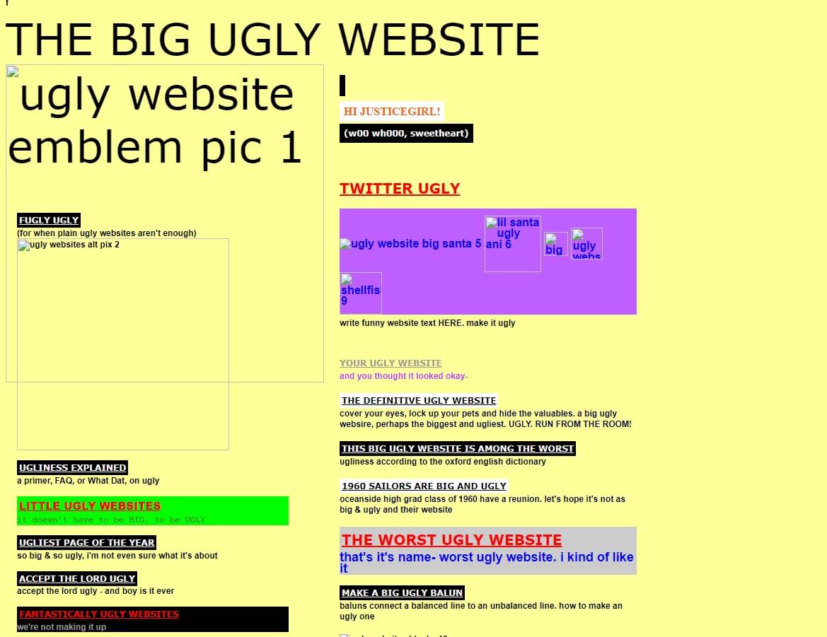
If your website has very sharp colors, unclear font style, inappropriate font size, and out-of-place images and videos, all these things are problematic. To say the least, they are not very much pleasing to the user’s eyes. The cost? An unhappy user who steers away to another site, pushing your website’s bounce rate up.
This quirky design down there is a good example of a bad website:

How to create a better website design and make it more appealing?
- Go for a minimalistic approach for an entire website design. Too many sections will clutter the web pages, resulting in a negative user experience.
- Choose your color scheme wisely, sharp colors are not recommended at all.
- Adjust your typography and maintain an asymmetrical layout throughout the web page.
- Use an understandable font style and avoid using more than 2 fonts on your website.
- Keep a good balance of images, videos, and infographics on the web page. Also, the placement should be balanced accurately.
- Keep the page sections in check, maintaining a balanced symmetry between the grids.
2- Cluttered Design and Weak Navigation
Clutter design and weak site navigation also act as major stumbling blocks in smooth user experience.
Complicated page designs will confuse the visitors and they won’t be able to understand what is available on your website. For instance, when sections are placed too close to each other or the content is not well-organized it will make the pages look cluttered.
Example:
Solution:
- Embrace White Space: Allow your content to breathe.
- Optimize Everything: Keep images, videos, and icons crisp.
- Give Room to Breathe: Proper spacing between elements is crucial.
- Section Sensibly: Avoid overloading pages with too many sections.
Don’t assume your visitors can read minds. Make your website a seamless guide, from one page to another. Effective communication is key. Keep it minimal and clear. When visitors land on your homepage, they should instantly grasp who you are and what you offer. This builds credibility and ensures confident interactions with your site.
3- Slow-loading and Non-responsive Website Design
Did you know that a whopping 53% of mobile users will bounce off a website if it takes more than 3 seconds to load? Imagine a visitor eagerly coming to your site only to be stuck waiting forever to see what they searched for. Slim chances are they’ll stick around – they’re likely to bolt and find a faster option.
Another common blunder designers make is neglecting the importance of prioritizing web design for both desktops and mobile phones. Some go for a desktop design first, only thinking about optimizing it for mobile later. What’s more concerning is the lack of testing to ensure designs are seamless and intuitive.
And what happens next?
The website loses a significant chunk of its total traffic, leading to a nosedive in user engagement, sales, conversions, and a spike in the bounce rate.
Here are some actionable design tips to make your site responsive and lightning-fast:
- Optimize Everything: Ensure sections, images, and CTAs work seamlessly on all screens.
- Spacing Matters: Adjust spacing appropriately for different devices; mobile designs may need less spacing compared to desktop ones.
- Embrace Cache-Boosting Plugins: Enable plugins that enhance caching for better loading times.
- Trim the Fat – Remove Unnecessary Plugins: Get rid of any plugins that are slowing down your website unnecessarily.
While the to-do list might seem lengthy, following these practical tips can significantly enhance your website’s responsiveness and loading time.
4- Inappropriate Placement of Pop-ups
Moving forward, poorly placed or excessive pop-ups are also among the common website design mistakes that can quickly drive visitors away from your website, causing frustration. No one wants to lose potential traffic to competitors due to annoying pop-ups. While pop-ups are often seen as intrusive, using them wisely can work to your advantage. Here’s how:
- Strategic Placement: Choose the right spot for pop-ups to appear on the screen.
- Focus on One Strong Goal: Opt for a single, compelling pop-up to achieve your desired outcome, whether it’s generating leads, making sales, or encouraging sign-ups.
- Avoid Pop-up Overload: Steer clear of having multiple pop-ups appear simultaneously on the page.
- Provide a Clear Opt-Out: Ensure visitors have a straightforward option to decline the pop-up.
Consider seeking advice from a professional to implement an effective and user-friendly pop-up strategy on your website.
5- Issues with Text Size and Arrangement
Text size plays a crucial role in content readability on a webpage. Using a font size that is too large or too small can impact visitors, forcing them to zoom in or making the text hard to read. Large chunks of text on a page can overwhelm readers, diminishing user engagement. See an example here:

When it comes to text arrangement, scattering it randomly across the page can distract readers and hinder their reading experience. To avoid these mistakes:
- Break Text into Smaller Paragraphs: Improve readability by breaking text into smaller paragraphs. Consider using bullet points or numbered lists.
- Optimal Text Size: Choose a text size that is suitable for everyone, not too big or too small. Pay attention to character spacing for a comfortable reading experience.
- Consistent Font Style: Stick to a single font style for a cohesive and enjoyable reading experience.
By implementing these strategies, you can enhance user engagement and ensure a positive experience for visitors to your website.
6- Weak Call-to-Action
Having a weak call-to-action (CTA) on your website is counterproductive and stands on the list of web design mistakes. Without a clear CTA button, visitors are less likely to engage or make product orders. A strong CTA is crucial for generating leads and conversions. Here are some effective tips:
- Prominence and Clickability: Make CTAs prominent and clickable.
- Timing and Placement: Serve CTAs at the right time and place.
- White Spacing: Use adequate white spacing for improved visibility.
- Emotional and Relatable Copy: Create copy that evokes emotions and resonates with your audience.
- Conciseness and Clarity: Craft a concise CTA with a clear message.
- Action-Oriented Focus: Focus on an action-oriented CTA.
- Testing: Test copy, color contrast, and CTA placement.
Implementing these tips will significantly enhance your website’s CTA effectiveness.
7- Generic 404 Web Page Design
A 404 page, or ‘error page,’ resulting from a broken link, can be unpleasant for visitors. Instead of using a generic message, consider these steps:
- Regular Link Checks: Check and replace broken links regularly.
- Custom 404 Page: Opt for a custom 404 page instead of a generic template.
- Redirects: Use 301 and 302 redirects to handle broken links effectively.
A custom 404 page helps engage visitors professionally and directs them to other web pages without frustration. Of course, no user likes a website with errors.
Final Verdict
Avoiding these web design mistakes is essential for turning your website into a valuable asset. A well-designed website can leave a lasting impression on potential visitors, encouraging frequent browsing. To achieve excellent usability, functionality, user experience, and overall website competence, steer clear of common design errors. Prioritize making your site aesthetically appealing, functional, and user-friendly to outperform competitors.
Remember to keep your target audience and business goals in mind during the design process. Revamping your approach with these considerations will elevate your website’s performance like never before.
[Also read: How Website Design Affects User Experience: 5 Important Points]